Psychology of Colors: How Colors Influence Mood & Space
The Psychology of Colors in Interior Design: How Colors Influence Mood & Space
Color is one of the most powerful elements in interior design. It has the ability to evoke emotions, influence behavior, and even alter perceptions of space. Understanding the psychology of colors in interior design can help you create a balanced and harmonious living or workspace. Whether you’re designing a cozy home, a productive office, or a vibrant retail store, selecting the right colors is crucial.
The Science Behind Color Psychology
Color psychology is the study of how colors impact human emotions and behaviors. This concept is widely used in branding, marketing, and interior design to create specific atmospheres. Each color has psychological properties that can make a space feel warm, cool, energetic, or tranquil.
According to research, colors can significantly affect mood and even physiological responses such as heart rate and stress levels. This is why hospitals often use calming blues and greens, while fast-food restaurants incorporate stimulating reds and yellows.
The Meaning of Different Colors in Interior Design
1. Red: The Color of Passion & Energy
Red is a powerful color that stimulates energy and excitement. It is often used in dining rooms, kitchens, and entertainment areas to encourage conversation and appetite.
- Best for: Dining rooms, kitchens, and social spaces
- Avoid: Bedrooms and relaxation spaces (unless used as an accent)
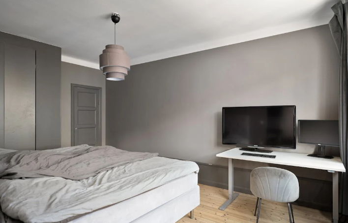
2. Blue: The Color of Calm & Focus
Blue promotes relaxation, serenity, and focus. It’s a popular choice for bedrooms, offices, and bathrooms where a calming atmosphere is desired.
- Best for: Bedrooms, bathrooms, and offices
- Avoid: Kitchens and dining areas (as it may suppress appetite)
3. Yellow: The Color of Happiness & Warmth
Yellow is associated with joy, optimism, and warmth. It works well in kitchens, entryways, and living spaces where a welcoming environment is key.
- Best for: Kitchens, hallways, and sunlit areas
- Avoid: Overuse in bedrooms, as it may cause restlessness
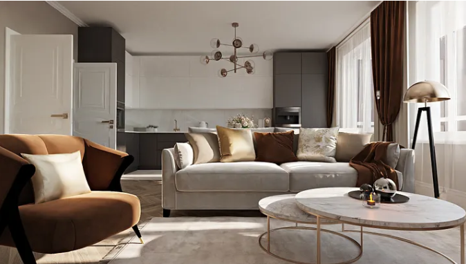
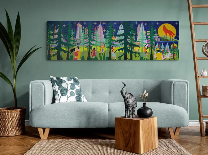
4. Green: The Color of Nature & Balance
Green represents harmony, growth, and balance. It is often used in living rooms, home offices, and bedrooms to create a sense of tranquility.
- Best for: Living rooms, home offices, and bedrooms
- Avoid: Excessively dark greens in small spaces (as it may feel overwhelming)
5. Purple: The Color of Luxury & Creativity
Purple is associated with royalty, creativity, and sophistication. Lighter shades like lavender create a calming effect, while darker purples add a sense of luxury.
- Best for: Bedrooms, meditation spaces, and creative studios
- Avoid: Overuse in workspaces, as it can be distracting
6. Orange: The Color of Enthusiasm & Warmth
Orange radiates energy and warmth, making it a great choice for fitness rooms, playrooms, and creative spaces.
- Best for: Gyms, playrooms, and social areas
- Avoid: Bedrooms and relaxation areas
7. White: The Color of Purity & Simplicity
White represents cleanliness, minimalism, and openness. It makes small spaces appear larger and works as a neutral base in modern interiors.
- Best for: Small rooms, kitchens, and modern homes
- Avoid: Too much white can make a space feel sterile and cold
8. Black: The Color of Elegance & Sophistication
Black adds depth, drama, and elegance to a space. It is best used as an accent rather than the dominant color.
- Best for: Accent walls, furniture, and decor
- Avoid: Overuse in small spaces, as it can feel overwhelming
How to Use Color Psychology in Interior Design
- Understand the Purpose of the Space
- Consider the function of each room before choosing colors. A bedroom should promote relaxation, while a workspace should enhance productivity.
- Use a Balanced Color Palette
- Incorporate a mix of warm and cool tones to maintain harmony. Neutral colors like beige, gray, and white can balance bold shades.
- Experiment with Accents
- If you’re hesitant about bold colors, use them in accents like cushions, rugs, or artwork rather than painting an entire room.
- Consider Natural Light
- The amount of natural light in a room affects how colors appear. Dark colors can make a poorly lit room feel smaller, while light shades can make it feel more open.
- Think About Psychological Impact
- Always consider how a color makes you feel before committing to it. What works in one setting may not work in another.
Conclusion (Psychology of Colors: How Colors Influence Mood & Space)
The psychology of colors in interior design plays a crucial role in shaping the ambiance of a space. By carefully selecting hues that align with the purpose of each room, you can create an environment that enhances mood, productivity, and overall well-being.
For more insights into color psychology, check out this article on color theory and this guide to choosing paint colors.
What colors resonate with you the most? Share your thoughts in the comments below!
2025 Trending Wall Colors for Every Room
Further reading
Leave a comment